PRODUCT DESIGN | SOCIAL PLATFORM FOR NON-PROFIT GIVING | Fall 2025
Bridging the gap: donors and non-profits
THE PROBLEM
Donors can’t tell which organizations are credible. Small non-profits can’t afford to reach the people who already care.
WHAT I DID
UI/UX and brand design for a social giving platform, from research to high-fidelity prototype.
THE RESULT
A social engagement platform for non-profits and donors to find each other.
ROLE
UI/UX design, brand design
TIMELINE
12 weeks
TEAM
Thomas Rimsa
CONTEXT
iOS, high-fidelity prototype
TWO PROBLEMS THAT ARE REALLY ONE
Donors worry about credibility and can’t find causes they care about. Non-profits don’t have the budget to reach the people who already do. And once a donation happens, neither side hears from the other again, so it rarely happens twice.
70%
of donors find the cause they support through word of mouth
This finding reframed the whole product. An act of giving leaves no trace, which leaves new donors at a loss. A social feed was our answer for a mechanism that people’s behavior already runs on.
CLEARING VISUAL CLUTTER THROUGH USER TESTING
The first wireframes tested badly, with feedback from participants saying there was too much noise. I consolidated Home and Search and reorganized Profile to clear up the navigation bar. We wanted to incorporate a Wallet to keep track of donations, so we paired that with the Profile for a cleaner look.
Iterations to get rid of the noise
WHAT WE DID DIFFERENTLY
I added challenges to make the giving process more visible and enticing. Your participation is visible, while your exact donations are private. This aligns with an interview insight we found: people who give regularly don’t want to announce it. Challenges give word of mouth something to travel on without asking anyone to put their generosity on display.
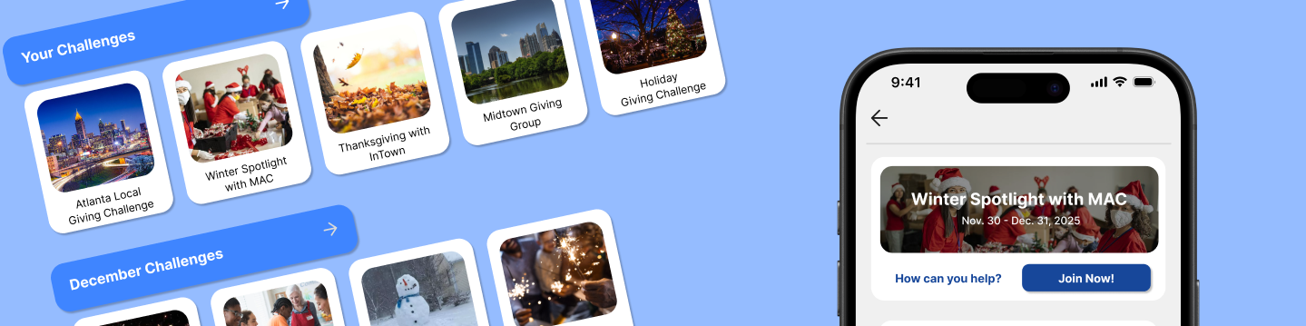
Home page
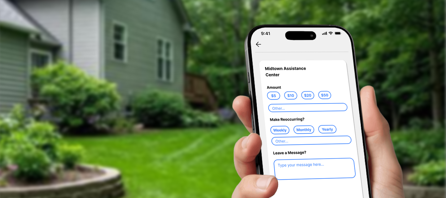
Making a donation
BUILDING TRUST THROUGH VISIBILITY
40% of people we spoke to had lost track of a recurring donation. The Wallet puts every donations, individual and recurring, in one place. Recurring donations pull from your Wallet balance, instead of running continuously unnoticed. A forgotten charge undoes the credibility the whole product is built on.
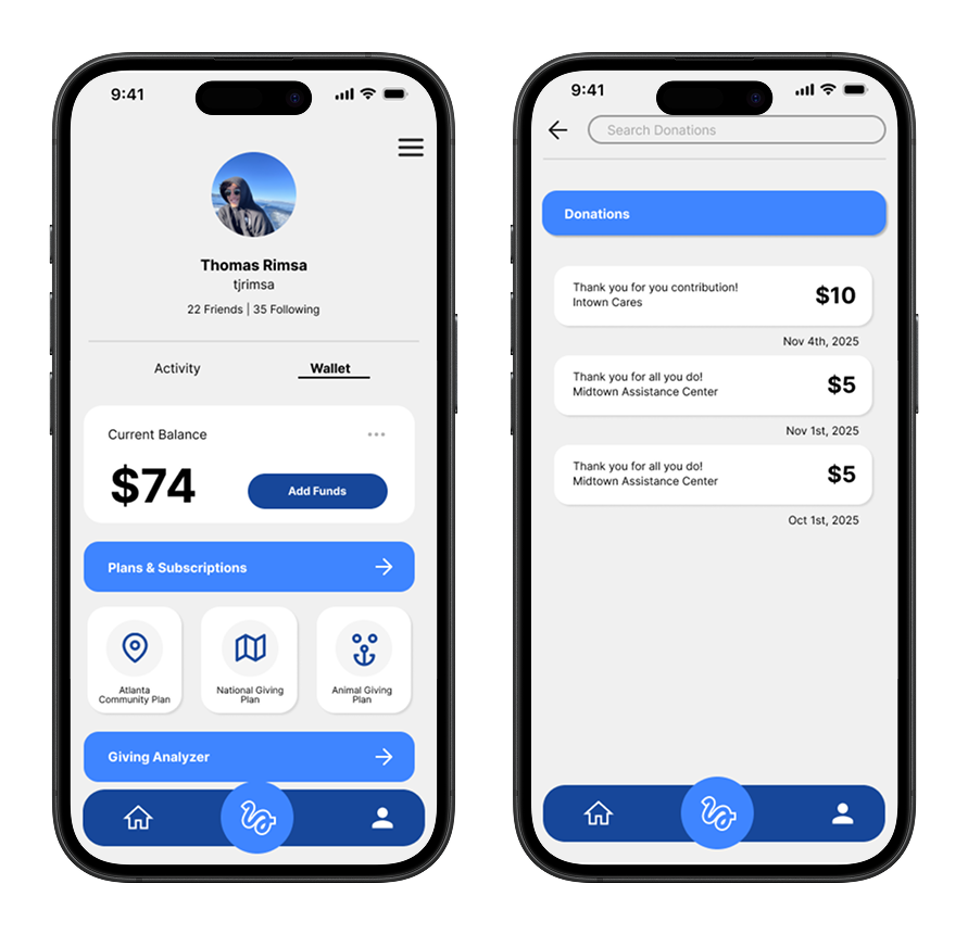
Wallet balance and history
THE OUTCOME
Ribbon is a social engagement platform for non-profits and donors to find each other. Users can engage in challenges to spread to word about causes they care about.
NEXT
Designing an interactive exhibit that requires no instruction
IMAZ →
PRODUCT DESIGN | SOCIAL PLATFORM FOR NON-PROFIT GIVING | Fall 2025
Bridging the gap: donors and non-profits
THE PROBLEM
Donors can’t tell which organizations are credible. Small non-profits can’t afford to reach the people who already care.
WHAT I DID
UI/UX and brand design for a social giving platform, from research to high-fidelity prototype.
THE RESULT
A social engagement platform for non-profits and donors to find each other.
ROLE
UI/UX design, brand design
TIMELINE
12 weeks
TEAM
Thomas Rimsa
CONTEXT
iOS, high-fidelity prototype
TWO PROBLEMS THAT ARE REALLY ONE
Donors worry about credibility and can’t find causes they care about. Non-profits don’t have the budget to reach the people who already do. And once a donation happens, neither side hears from the other again, so it rarely happens twice.
70%
of donors find the cause they support through word of mouth
This finding reframed the whole product. An act of giving leaves no trace, which leaves new donors at a loss. A social feed was our answer for a mechanism that people’s behavior already runs on.
CLEARING VISUAL CLUTTER THROUGH USER TESTING
The first wireframes tested badly, with feedback from participants saying there was too much noise. I consolidated Home and Search and reorganized Profile to clear up the navigation bar. We wanted to incorporate a Wallet to keep track of donations, so we paired that with the Profile for a cleaner look.
Iterations to get rid of the noise
WHAT WE DID DIFFERENTLY
I added challenges to make the giving process more visible and enticing. Your participation is visible, while your exact donations are private. This aligns with an interview insight we found: people who give regularly don’t want to announce it. Challenges give word of mouth something to travel on without asking anyone to put their generosity on display.
Home page
Making a donation
BUILDING TRUST THROUGH VISIBILITY
40% of people we spoke to had lost track of a recurring donation. The Wallet puts every donations, individual and recurring, in one place. Recurring donations pull from your Wallet balance, instead of running continuously unnoticed. A forgotten charge undoes the credibility the whole product is built on.
Wallet balance and history
THE OUTCOME
Ribbon is a social engagement platform for non-profits and donors to find each other. Users can engage in challenges to spread to word about causes they care about.
NEXT
Designing an interactive exhibit that requires no instruction
IMAZ →